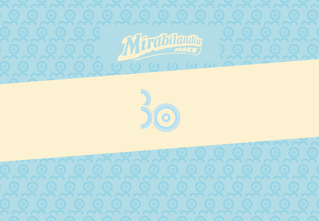
Logo Design: Mirabilandia’s 30th anniversary
The pictogram was created by combining two distinctive stylized elements: the wheel and the coaster.
Together they act as if they were constantly moving gears, a celebration and symbol of the Park's dynamism. The pictogram can also be used as a decorative element: if turned by 90°, it becomes
a “landscape” where the wheel overlooks 2 rollercoasters.
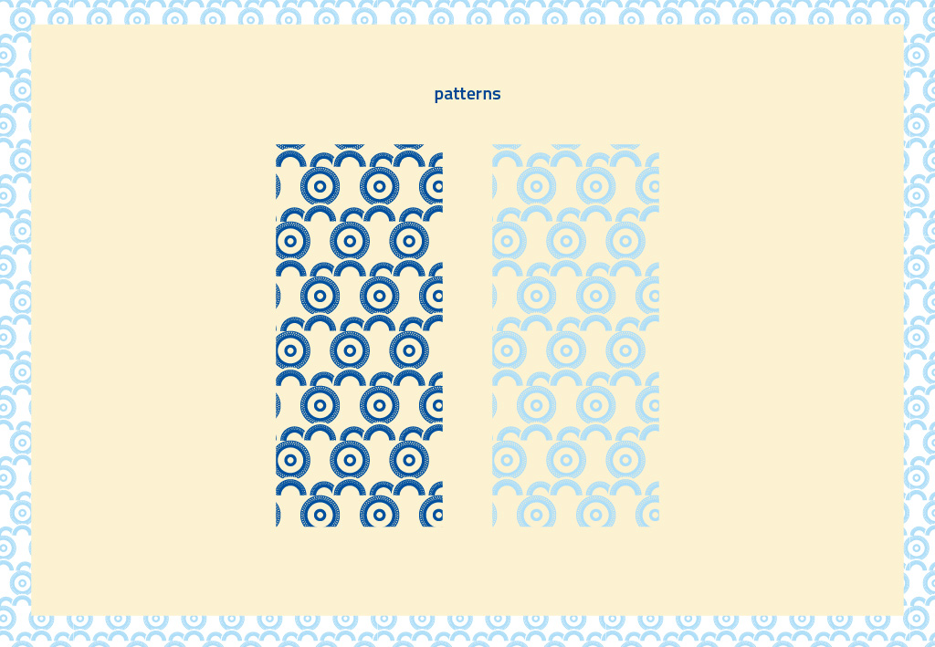
The coloration is blue (in chromatic perception blue-cyan colors take on a meaning of security,
tranquility and reliability) and a more "nuanced" multi-color variation.